Mont Saint-Michel’s Brand Identity Illustrates a Shift from Postcard to Public Infrastructure
- CBO Editorial
- Jan 20
- 3 min read

Updated: Feb 16
Analytical Signal: Mont Saint-Michel’s new brand identity exemplifies a broader shift in destination branding—from image-led tourism marketing to system-led brand governance designed for legal protection, multi-stakeholder alignment, and long-term operational coherence.

Why Mont Saint-Michel Needed a New Brand Identity
For centuries, Mont Saint-Michel has functioned as one of the world’s most instantly recognizable visual assets. Its silhouette is already everywhere—on postcards, social feeds, souvenirs, and screensavers. The challenge facing its custodians in 2026 was therefore not recognition, but control.
That challenge became urgent with the establishment of the Établissement Public National du Mont-Saint-Michel, a new public body created to unify governance across the abbey, the village, the bay, and visitor infrastructure. A fragmented visual landscape—multiple logos, inconsistent typography, and ad-hoc signage—was no longer compatible with the scale or complexity of the site.
The brief, as relayed by the initiative's design team Graphéine, was explicit: the Établissement Public National du Mont-Saint-Michel commissioned an identity that is strong, distinctive, and legally protectable, designed to unify governance across the abbey, the bay, and visitor infrastructure.
From Iconic Silhouette to Institutional Identity System
The design team at Graphéine made an early strategic decision: the abbey itself would not become the logo.
From a brand-strategy standpoint, this was less radical than it appears. Figurative depictions of Mont Saint-Michel are visually powerful, but they are also:
nearly impossible to trademark in a meaningful way,
easily diluted through repetition and variation,
poorly suited to dense institutional uses such as wayfinding, tickets, legal documents, and digital interfaces.
Instead, the identity centers on a typographic mark, shifting brand equity from image recognition to name authority. The move reframes Mont Saint-Michel not as a picture to admire, but as an institution to navigate.


Typography as Public Infrastructure in Heritage Branding
At the core of the system is a custom typeface developed in collaboration with Blaze Type. Rather than reproducing medieval scripts literally, the designers studied Gothic letterforms found in manuscripts historically associated with the abbey and abstracted their vertical tension, rhythm, and gravity into a contemporary type family.
For the designers, typography was not an aesthetic layer but a structural one—a tool capable of carrying history while remaining operationally rigorous. The resulting typeface functions simultaneously as:
a cultural reference,
a unifying interface across touchpoints,
and a proprietary asset the institution can own, license, and govern.
In practice, this allows the brand to scale cleanly across signage, uniforms, publications, digital platforms, and administrative materials—without relying on illustrative shortcuts.


Expanding the Brand from Monument to Territory
Another notable shift is spatial. The identity does not confine itself to the abbey; it explicitly integrates the bay as part of the brand narrative. Visually, this appears through horizon-based compositions, fluid layouts, and color systems derived from the tidal environment.
This choice reflects a strategic repositioning: Mont Saint-Michel is not only a monument to be photographed, but a living, protected ecosystem shaped by movement, weather, and time. By embedding this idea into the visual system, the brand aligns more closely with contemporary expectations around environmental stewardship, visitor flow management, and experiential coherence.
For a site welcoming more than two million visitors annually, this is not symbolic—it directly supports wayfinding clarity, crowd distribution, and a calmer on-site experience.


What Mont Saint-Michel’s Brand Identity Signals for Destination Branding Globally
What makes this rebrand trend-defining is not its aesthetics, but its intent addressing three converging pressures:
Governance complexity is increasing, requiring brands that clarify authority rather than merely attract attention.
Legal defensibility is becoming central as destinations monetize IP through licensing, events, and partnerships.
Experience consistency is now expected across physical and digital journeys.
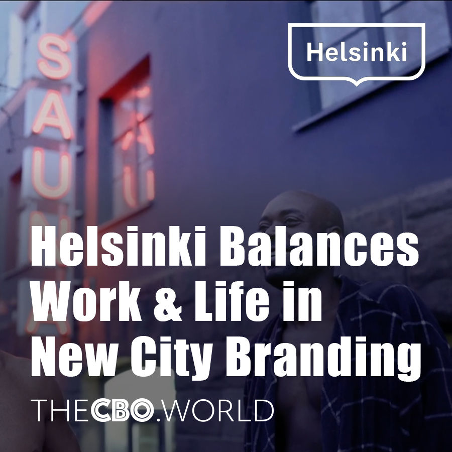
Mont Saint-Michel’s identity responds to all three by treating brand design as infrastructure. Across global cities and heritage institutions, similar shifts are visible. Amsterdam and Helsinki have moved toward restrained, system-led city identities designed to function across civic services rather than tourism campaigns, while Seoul continues to evolve a modular, typography-forward identity to support digital governance and cultural exports at scale. Major cultural institutions such as The British Museum, Centre Pompidou, and The Metropolitan Museum of Art have similarly prioritized identity systems that unify exhibitions, research, retail, and global partnerships under a single authoritative framework. At protected heritage sites—from Machu Picchu to the Acropolis of Athens—branding decisions are increasingly shaped by conservation mandates, visitor-flow control, and state oversight rather than pure image-making. Seen in this context, Mont Saint-Michel’s rebrand is part of a broader redefinition of destination branding as public infrastructure: less about visual seduction, more about institutional coherence, legal control, and long-term stewardship.
The lesson is clear: the future of place branding lies in what can be sustained, protected, and governed over time.

Comments